
9
Case study
OB/GYN Scheduling
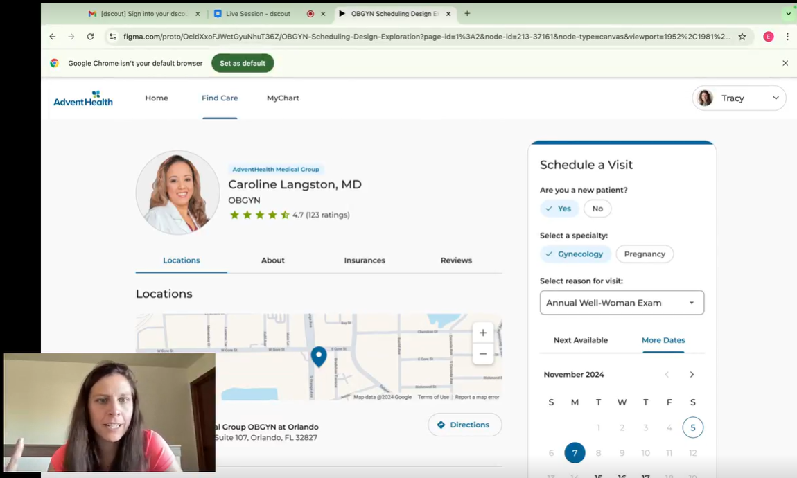
This usability study examined a proposed solution to a common issue where consumers incorrectly self-schedule visits while searching for care, leading to difficulties with rescheduling and even cancellations. We evaluated how consumers interact with the new proposed experience during key tasks, such as scheduling and requesting appointments.
Study Overview
This usability study examined a proposed solution to a common issue where consumers incorrectly self-schedule visits while searching for care, leading to difficulties with rescheduling and even cancellations. We evaluated how consumers interact with the new proposed experience during key tasks, such as scheduling and requesting appointments.
Observations provided insights into user expectations, delighters, and areas where the prototype may need refinement to better align with our patients' needs.
Key Findings
- All participants were able to book an annual exam successfully.
- All participants found booking an annual exam through the scheduler quick and simple.
- Some participants wished they knew the appointment duration for planning purposes.
- Some participants prefer online scheduling to cross-reference personal calendars and availability easily.
- Most participants valued the option to choose “Something Else”, but were disappointed about having to request an appointment.
- Most participants felt the options were clear, and sufficient. Although some expect to see more specific options like “pap” included in the list.
Previous Experiences
Before we observed participants interacting with the prototype, we talked with the participants about their previous experiences scheduling with their OB/GYNs to gain deeper understanding and empathy. Some participants found it challenging to schedule appointments through the application. This difficulty was not due to usability issues, but rather the frustration of being rescheduled from appointments that had been booked months in advance. As a result, patients often had to wait even longer, sometimes several months beyond their original appointment date.
SharePoint Stream
Frustrated by getting rescheduled from an appointment that was pre-booked-193501
SharePoint Stream
Didn't need to have this appointment
One participant mentioned the convenience of scheduling appointments via their mobile application, which helped her cross-reference her schedule; however, not understanding the “medical jargon” led one participant to inadvertently book three appointments, unaware that she didn't need all of them.
This experience highlighted her desire for greater transparency regarding the types of appointments and their respective names within the application. The complex nomenclature further exacerbated the difficulty for patients in selecting the appropriate appointments.
“It makes me feel like a number…" — Bri D.
Proposed Experience
In the task portion of the study, all participants were able to successfully complete the task of scheduling an annual exam with the OB/GYN using the proposed design. Participants reported finding the scheduling process straightforward and easy to locate on the screen, indicating that the streamlined design supported efficient task completion. Notably, each participant completed the scheduling process quickly, expressing that the task was simpler than their current appointment scheduling methods.
The consistency in positive feedback highlights the prototype's effectiveness in reducing common pain points in appointment bookings. The simplicity and efficiency of the proposed scheduler appear to improve upon existing methods by providing a more intuitive experience.
Reason for Visit Options
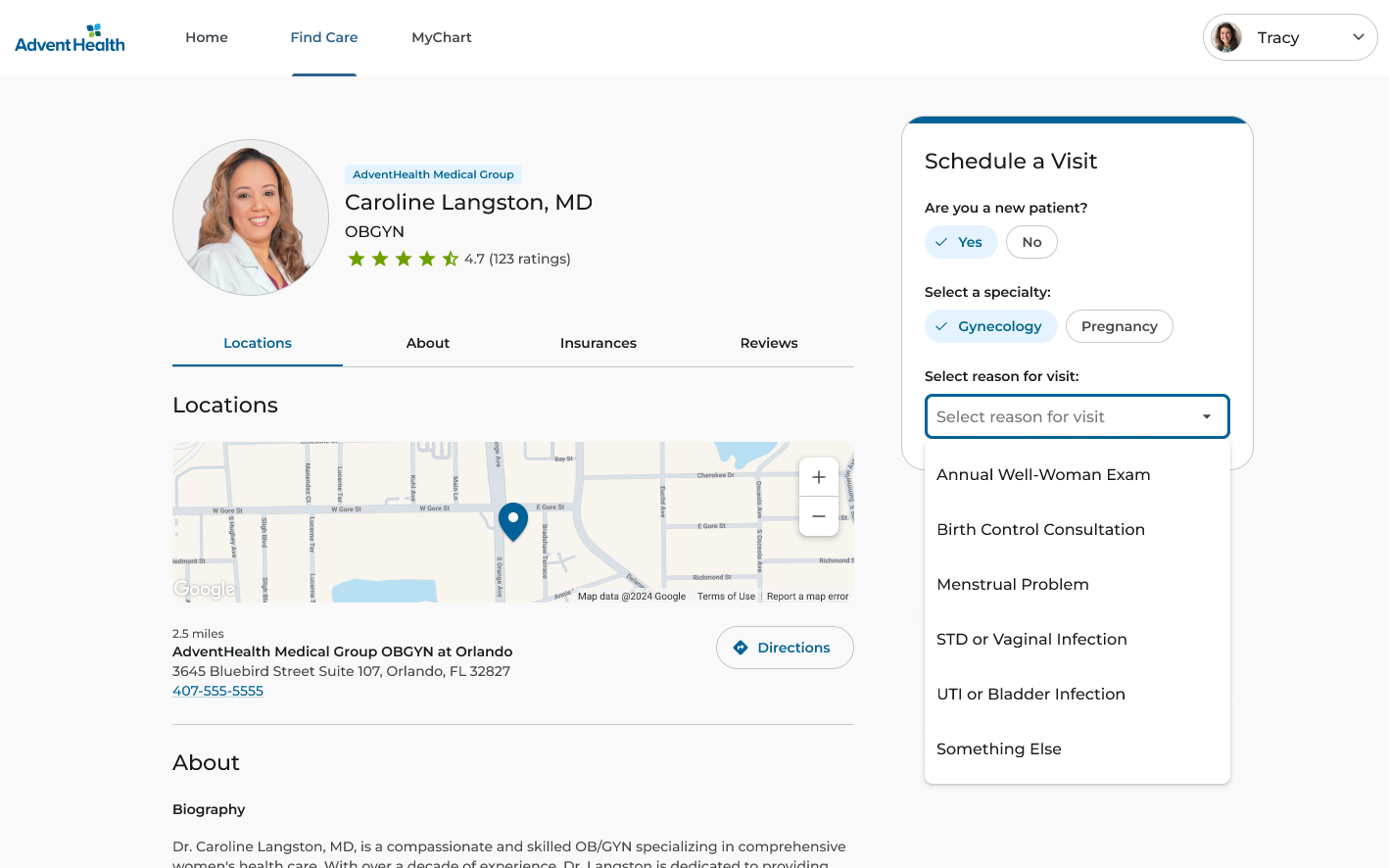
The "Reason for Visit" drop-down menu was clear and understandable to all of our participants. The options provided addressed most of the common needs expressed by our patients. While many participants appreciated having a "catch-all" option for less common reasons for visits, some expressed a desire for more detailed visit options.
For example, Bri and Laragh highlighted the importance of including options such as "follow-up" and "pap" tests in addition to “Annual Well-Woman Visit.”
SharePoint Stream
Expectations of _Something Else_ option-193481
Additionally, Laragh indicated that some commonly listed symptoms could be expanded to be more personal and allow the system to know your status and what you need based on your previous interactions.
Some individuals, like Caitlin, preferred specific categories over a “catch-all” request to ensure that she is not rescheduled by the office due to a reclassification of her original appointment type.
“You don't have to think. It was easy to select the reason and time.”
— Liyah R.
SharePoint Stream
The system should know me
Requesting Appointments
Participants found the appointment request process confusing. They were unsure of the process and whether they would actually get an appointment. Some individuals felt this language was off-putting and preferred a more straightforward scheduling option.
For example, participants Roshel and Laragh questioned whether their requests could be denied or how they would be processed if appointments were not confirmed immediately. In contrast, Caitlin and Erica felt that submitting a request was no better—and perhaps worse—than simply calling to schedule an appointment.
Additionally, most participants, like Laragh, expressed a preference for asynchronous scheduling options, including receiving follow-up email confirmations over sending a nebulous request.
SharePoint Stream
Frustrated by request an appointment
"…it's a fools errand." (requesting appointments) — Caitlin R.
SharePoint Stream
Time of day options make sense
Date Range Picker
Some participants preferred selecting specific dates and times when requesting appointments over selecting a general range, as they felt this would offer more control and precision and better align with how they plan their day-to-day activities.
Participants like Erica and Stephanie preferred to select individual days or times over a broader date range. For instance, Carissa suggested that time-of-day options, like morning or evening preferences, would be more intuitive.
Caitlin was concerned about possibly needing to call the office after completing the selection process. Jacqueline similarly described the date range as “ambiguous” and noted a lack of clarity around provider availability. We should consider solutions to accommodate consumer preferences for specific dates and times.
"Seeing the dates versus a range would make me feel more secure…" — Jaqueline K.
Confirmation Screen
Participants appreciated the clarity of the confirmation screen but suggested improvements to better support their scheduling needs.
Participants Laragh, Roshel, and Erica wanted more logistical details, such as estimated costs (co-pays), appointment duration, and arrival time, as these would help them plan their day more effectively. Additionally, they suggested including travel time estimates, especially for mobile devices, to assist with arrival preparation.
Overall, the feedback on the confirmation screen highlights participants' desire for an information-rich yet streamlined view that allows them to review key details and understand the logistical elements of their appointment at a glance.
SharePoint Stream
Expects to see a price estimate and insurance
Urgent System Message
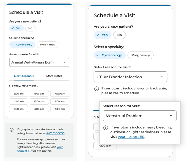
With our study spanning two days, we used this opportunity to deploy an A/B test between two different approaches for an alert message that gives vital direction to patients who may experience symptoms that are too severe to be handled by OB/GYN providers.
In measuring the performance of Option A, most participants were unable to initially notice this alert message as the focus was on the task and completing the steps inside the proposed widget.
Options B placed the alert directly below where the participants interacted, which greatly improved the element's visibility; in fact, all participants who viewed Option B could notice the message. Many participants noted that this alert message seemed to create a sense of urgency, though they were unsure why this was necessary, as most participants would not log into their accounts to schedule an appointment if they were experiencing these symptoms. Others felt that symptoms like “heavy bleeding” and “back pain” are common symptoms that they do not consider “urgent”.
Other Observations
Knowing the Patien t: Participants expressed that the system should already know if they are a “new patient” or not.
Provider Profiles: Participants highlighted the importance of thorough pre-appointment research, including options to view provider reviews and filter relevant information within the provider profile. The ability to filter reviews while also providing a short summary to patients similar to the format used on Amazon would enhance their ability to qualify providers.
Timing of Information Disclosure : Participants felt that the map may be more useful in a confirmation email or reminder email closer to the appointment date rather than prior to scheduling the appointment.
Conclusion
This usability study demonstrated that the OB/GYN scheduling prototype offered a significantly improved experience compared to participants' current scheduling methods. All participants successfully completed the task of booking an annual exam quickly and without any issues, praising the prototype’s simplicity and ease of use. They particularly appreciated the intuitive flow of the scheduler.
The study's findings also highlight key areas for consideration to further enhance the OB/GYN scheduling experience.
- Consider adding specific date and time selection options for patients when they request appointments. This will enable them to provide specific preferences to the office staff, helping to reduce the back-and-forth communication needed to find an appointment that works for both the patient and the provider.
- Explore how a more detailed confirmation screen could include containing estimated arrival times, copay costs, and insurance details. This would meet user expectations for transparent scheduling information and reduce the financial surprises patients routinely experience.
- Consider incorporating review summaries and filtering options in provider profiles that resemble what patients commonly encounter on e-commerce sites. This could assist consumers with their research and help them make informed scheduling decisions more quickly.
- Consider enhancing the specificity of the "Reason for Visit" menu, especially the “Annual Well-Woman Visit,” to minimize confusion about which appointment option best fits the patients' needs.
- Explore how we might reduce disappointment when patients are forced to request appointments and do not see available appointment times, which is their preferred method of scheduling.
Contact
Want to talk through the OB/GYN Scheduling study?
The findings, research choices, or the decisions this work informed — happy to get into any of it.
A good conversation is usually the best start.