
100
Case study
Online Scheduling - Checkout Web Experience
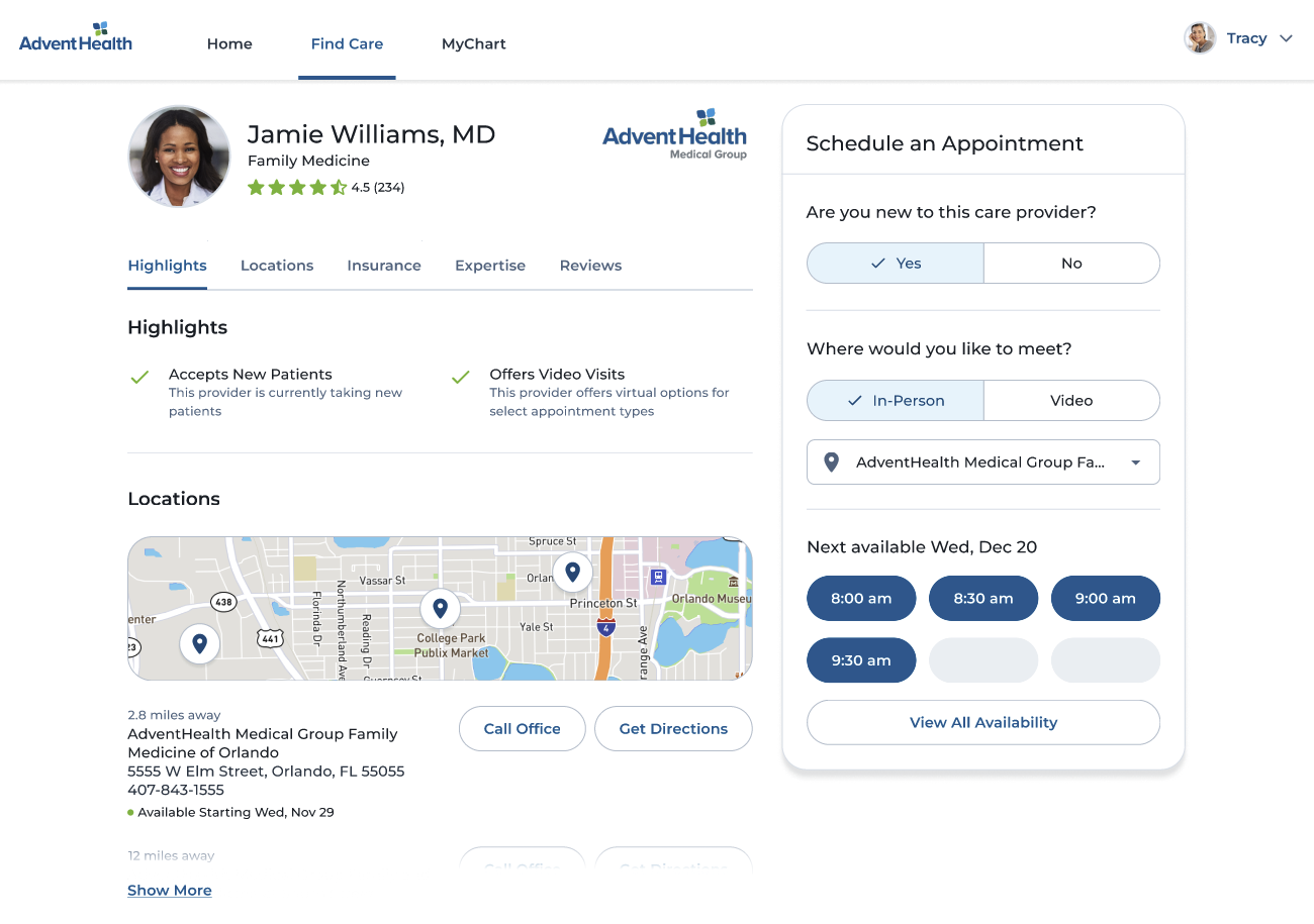
With this study, we aimed to evaluate whether the proposed changes to the provider profiles and appointment scheduling entry points simplified and streamlined the booking process with our providers.
Study Overview
With this study, we aimed to evaluate whether the proposed changes to the provider profiles and appointment scheduling entry points simplified and streamlined the booking process with our providers.
The updates proposed were intended to reduce the number of abandoned checkouts, make it easier to schedule appointments and increase the overall online self-scheduling rate.
To accomplish this, we observed consumers as they completed three separate tasks involving scheduling an in-person appointment, a video visit, and requesting an appointment from a provider who does not offer online scheduling. We then asked our participants to review UI elements to assess the effectiveness of our new scheduling widget on the web.
Key Findings
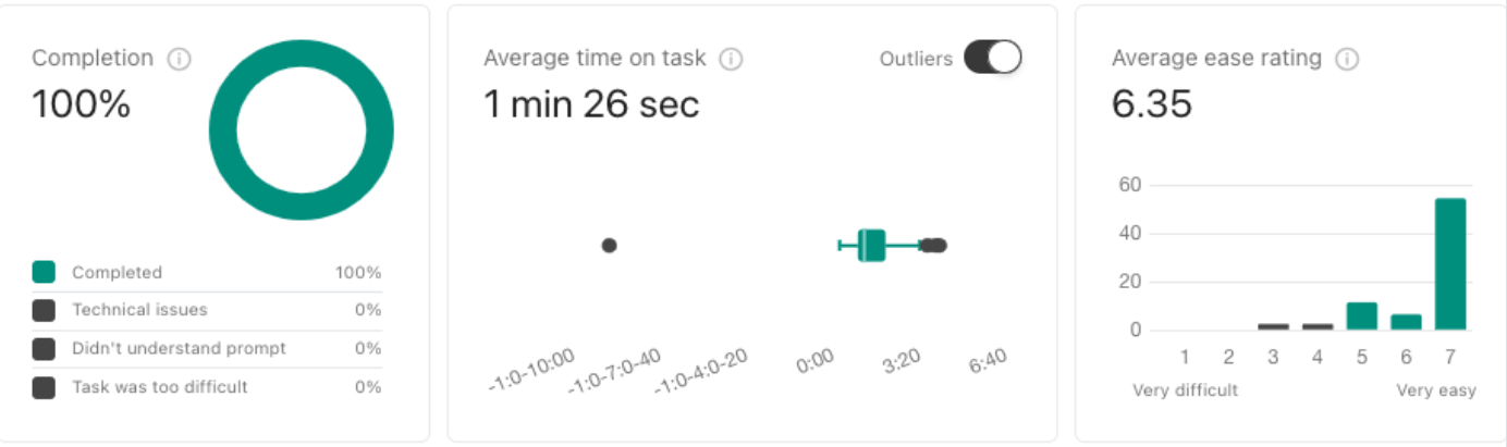
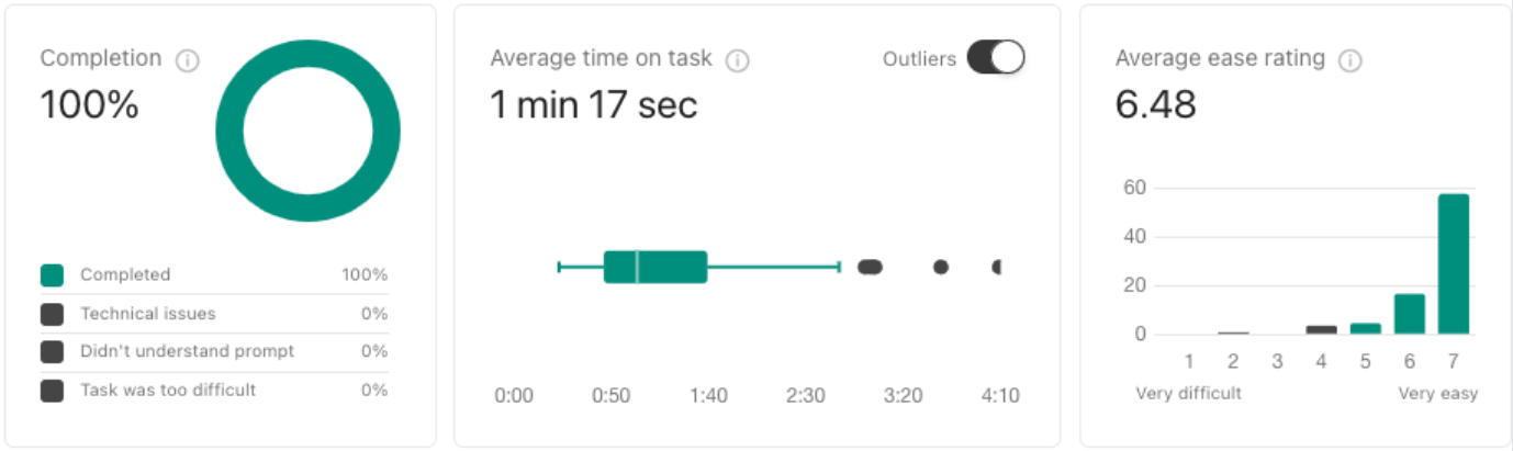
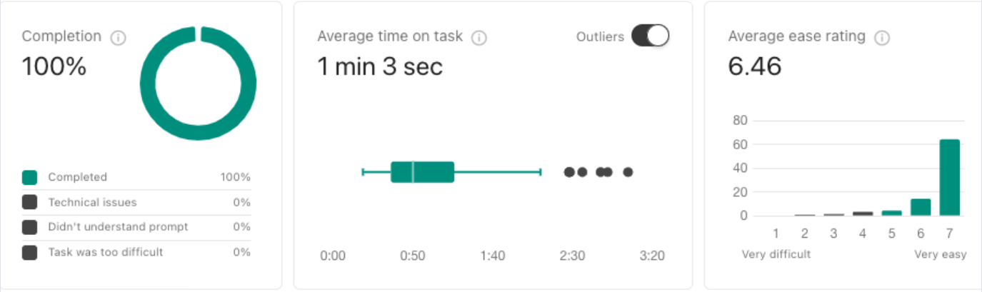
- The study showed that the proposed design update worked very well, with high ease ratings (6+ out of 7) for ALL tasks with an average completion time of 75 seconds .
- Participants did not pay much attention to the initial scheduling questions and moved quickly to the time slot buttons to progress with the task, leading to confusion and lower scores.
- When requesting appointments, participants want to know how they will be contacted.
- Some participants wanted to see more dates , start in a calendar, or enter a time preference when requesting an appointment.
- For a future iteration, we'd like to launch a follow-up study with a simple A/B test between two different modifications with the scheduling widget
Effective Design Update
The study showed that the proposed design update worked very well. When ignoring the low scores from participants who had problems loading the prototype, all tasks scored above a 6 (out of 7) in the ease rating. Participants took, on average, 75 seconds to find the right time slot and book their appointments successfully.
SharePoint Stream
Successfully Completing the Task
Task #1
You need to schedule a video visit with a new health care provider, and Dr. Jamie Williams has availability. To complete the task, please use the prototype to schedule a video visit with Dr. Jamie Williams at the earliest available appointment .
*The data from technical issues have been removed
SharePoint Stream
Missed Initial Video Visit Option
Initial Scheduling Options
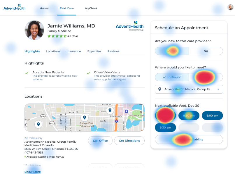
We identified a negative trend during our study where participants tended to overlook the initial scheduling questions and moved directly to selecting the time slot buttons to proceed. After that, they would click on "view more" and try to find the specified time slot using the calendar or other filter options, but they would not be able to find it or would be confused due to the prototype dates and times being inconsistent between screens.
It is important to note that successfully completing the tasks was reliant on the selections made in those initial steps, which were often overlooked.
Based on the click data, it was observed that around one-third of the participants directly selected the first available time slot without selecting the required video visit option first. Additionally, there was a noticeable increase in the number of clicks on the incorrect time frame, which indicated confusion.
It's important to note that outside of the prototype, participants would not be stuck in this situation. They would have the option to select their preferred time frames using the filtering options provided on subsequent screens.
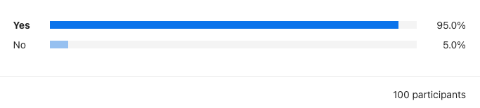
Even though some participants missed or skimmed initial scheduling screens, they reported that the information presented was easy to understand in all three of our task scenarios.
In our first task, 95% of the participants also felt that the scheduling information presented on the Provider profile screen for new patients was easy to understand.
Task #2
“It has been a year since you last visited your health care provider, Dr. Jamie Williams. You have accessed your patient portal and found Dr. Williams' profile. Using the prototype, please schedule an annual checkup with Dr. Jamie Williams on Friday, January 5th, at 4 pm. ”
*The data from technical issues have been removed
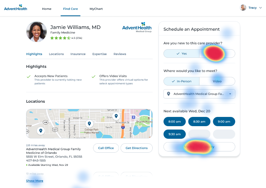
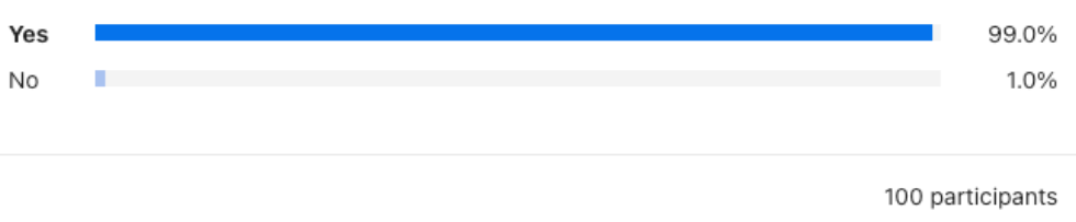
Click data shows over half of the participants correctly recognized the task can only be completed by an existing patient. In contrast, the others selected more availability to find the appointment needed. In doing so, participants needed to come back and select that they were a returning patient. Again, participants reported that the information was easily understandable by a wide margin.
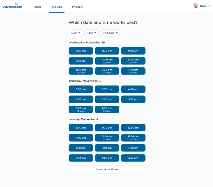
Viewing All Availability
93% of participants reported that when viewing more availability, the information was easy to understand. A few participants expressed dissatisfaction with the amount of scrolling and the limited number of dates initially displayed.
SharePoint Stream
Time slots not easy to understand
Task #3
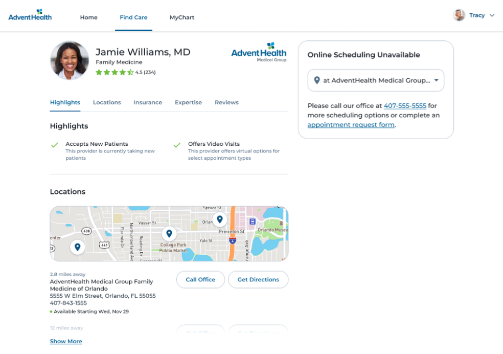
It has been a year since you last visited your health care provider, Dr. Jamie Williams. You have accessed your patient portal and found Dr. Williams' profile. Using the prototype, please schedule an annual checkup with Dr. Jamie Williams on Friday, January 5th, at 4 pm.
*the data from technical issues have been removed
During our observation of participants completing the final task, we discovered that when the provider they wanted to see did not offer online scheduling, most of them preferred to call the office to book an appointment instead of filling out an appointment request. According to the participants, calling the office allowed them to talk to a real person, ask questions, and receive additional information.
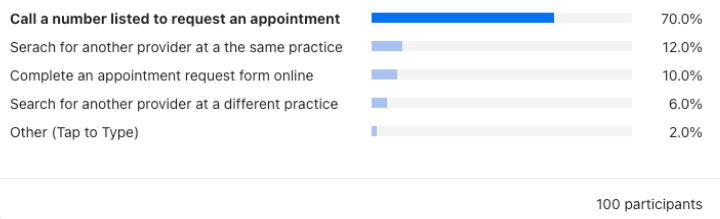
However, phone scheduling also had its drawbacks, such as long wait times, voicemails, limited office hours, and miscommunication being reported.
Other alternatives included:
- Find a different provider that offers online scheduling
- Go to the provider's office, in-person to schedule an appointment
- Use a third-party resource to schedule an appointment
- Send a text message to the provider to schedule an appointment
- Use a chat method to schedule an appointment
- Complete an appointment request form
Expectations After Requesting an Appointment
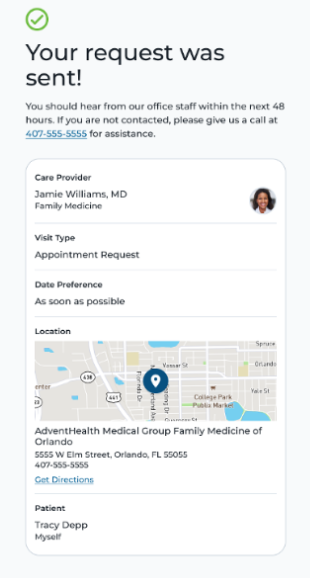
Participants who have requested an appointment would like to see more information displayed on the confirmation screen, for instance, seeing the mode of communication that would be used to contact them, such as through phone or email.
They expect to see the appointment request in their portal and receive guidance on alternative steps in case of any issues. They would also like to have access to a direct hotline for emergencies.
They want to be able to easily modify or cancel appointments to adjust to their dynamic schedules. They prefer to receive appointment confirmations through email or text, which helps them stay assured and clear about the appointment details.
To cater to their individual needs, consumers feel it is important to offer options for entering their time and day preferences, choosing a different provider or location, and staying informed about appointment availability.
Also, providing easy access to the required forms, proactive reminders, and follow-ups can help reduce office wait times and avoid any roadblocks.
SharePoint Stream
Requesting an Appointment
Conclusion
The study has found that the proposed design update for the scheduling widget was successful. This was reflected in high usability scores and efficiency.
Prompt comprehension and navigation complexities for participants were small and mainly due to skimming and skipping important filter options early in the tasks.
The study showed that participants preferred to view more days of availability and start from a day of their choosing when viewing time slots. Our team plans to review and refine the work based on feedback during the upcoming development cycles. Once the proposed improvements are finalized, we will conduct another study using two different versions of the widget to assess the participants' perception of ease and ability.
Contact
Want to talk through the Checkout Experience Web study?
The findings, research choices, or the decisions this work informed — happy to get into any of it.
A good conversation is usually the best start.