
4
Case study
App 3.0 - In-person Study
This study is the first in a series of studies where we will examine whether the new iterations of the 3.0 Mobile app designs address the existing pain points identified in previous studies and stakeholder communications.
Study Overview
This study is the first in a series of studies where we will examine whether the new iterations of the 3.0 Mobile app designs address the existing pain points identified in previous studies and stakeholder communications.
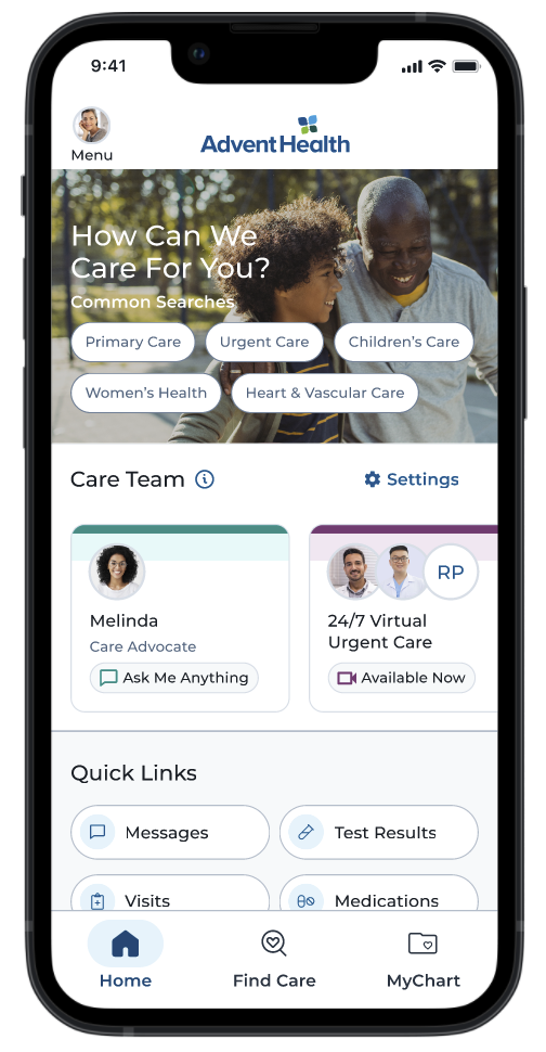
Our primary focus was on the improvements to the Home Page, Shopping Experience, Care team, and MyChart education experiences.
Our recent updates to our healthcare app aims to address consumer concerns, enhance functionality, and improve overall satisfaction. In this article, we delve into the design and layout considerations, features, and overall experience to provide insights into the consumers' impressions of the enhancements made in the 3.0 mobile app update.
Key Findings
- There was a mixed response regarding the 3.0 update where some participants praised the new design and quick access to the information they use most, but others found the update confusing as they were not sure where to go.
- The participants expressed their desire for a more personalized experience, including the common search recommendations and suggested classes and events.
- Participants wanted to see their providers first on the home page, rather than the virtual care or ask-me-anything options. They felt that these options were not relevant or useful for them, and they wanted to have direct access to their regular Care Team and not hunt for them.
- The participants experienced confusion and frustration when taken out of the app to external pages.
- Enabling the app's accessibility options caused several usability issues. The layout was disjointed due to hidden buttons and larger menu items. In addition, the team observed some UI problems with the text size, search bar, and contrast of the web pages.
- Participants liked that they had easy access to their health updates but wanted to have direct access to their historical records vs clicking through links and sending requests.
- Participants found the new test results screen and trends feature easy to use and informative.
- We encountered technical issues and bugs with the app, such as the search feature not working, the schedule visit button not functioning, and the search bar not returning results.
Mixed Reactions
While these improvements were met with widespread appreciation, participant reactions to the overall experience varied. A segment of participants expressed their dissatisfaction with the new app. They found it confusing and frustrating as it deviated from their familiar processes. They were unsure of how to accomplish common tasks and became frustrated when they couldn't easily locate the necessary features.
In contrast, some participants were pleased with the updated layout, stating that it was more friendly and informative. Specifically, the participants commended the inclusion of fast access to their test results, which streamlined the most frequent tasks that our consumers perform. They also appreciated the new test results page and the ability to view their results visually over a period of time.
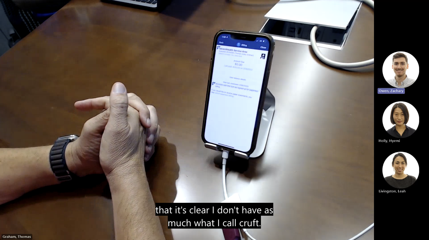
The patients found it particularly helpful to receive timely updates regarding their health information and appointment reminders.
Participants did not notice any delineation between AdventHealth-specific features and MyChart experiences and saw both as one cohesive environment. The mixture of varying navigation rules caused frustration , and we, again, observed participants stay in MyChart to explore their health options.
“I don’t think it’s (3.0 Update) more helpful, it’s about the same. Too much change.”
— Henry


"The app feels "friendlier" and "more detailed" than MyChart environment"
— Terri
Preference for Personalization
Our study revealed that personalization is not just a luxury but a necessity for our health care app. Participants, like Jennifer and Terri, emphasized the importance of personalized recommended searches listed on their home screens. They expressed dissatisfaction with the app's existing commonly searched care categories, which they found too broad, vague, and non-applicable. Terri felt that options like oncology, cardiology, or imaging would enable her to find suitable health care more efficiently. This desire for tailored content stems from the need for informed decision-making, empowering consumers to take charge of their health.
There is a clear interest in Classes and Events with our consumers. When viewing the experience, some participants suggested having a curated list of classes and events categories tailored to their specific health needs, vs a general search process. As one participant remarked, "I wouldn't know what to search for" when confronted with a generic search bar. Tailoring content to specific health conditions or interests addresses this challenge, making the app more engaging and encouraging users to return to the app for more than just viewing health records.
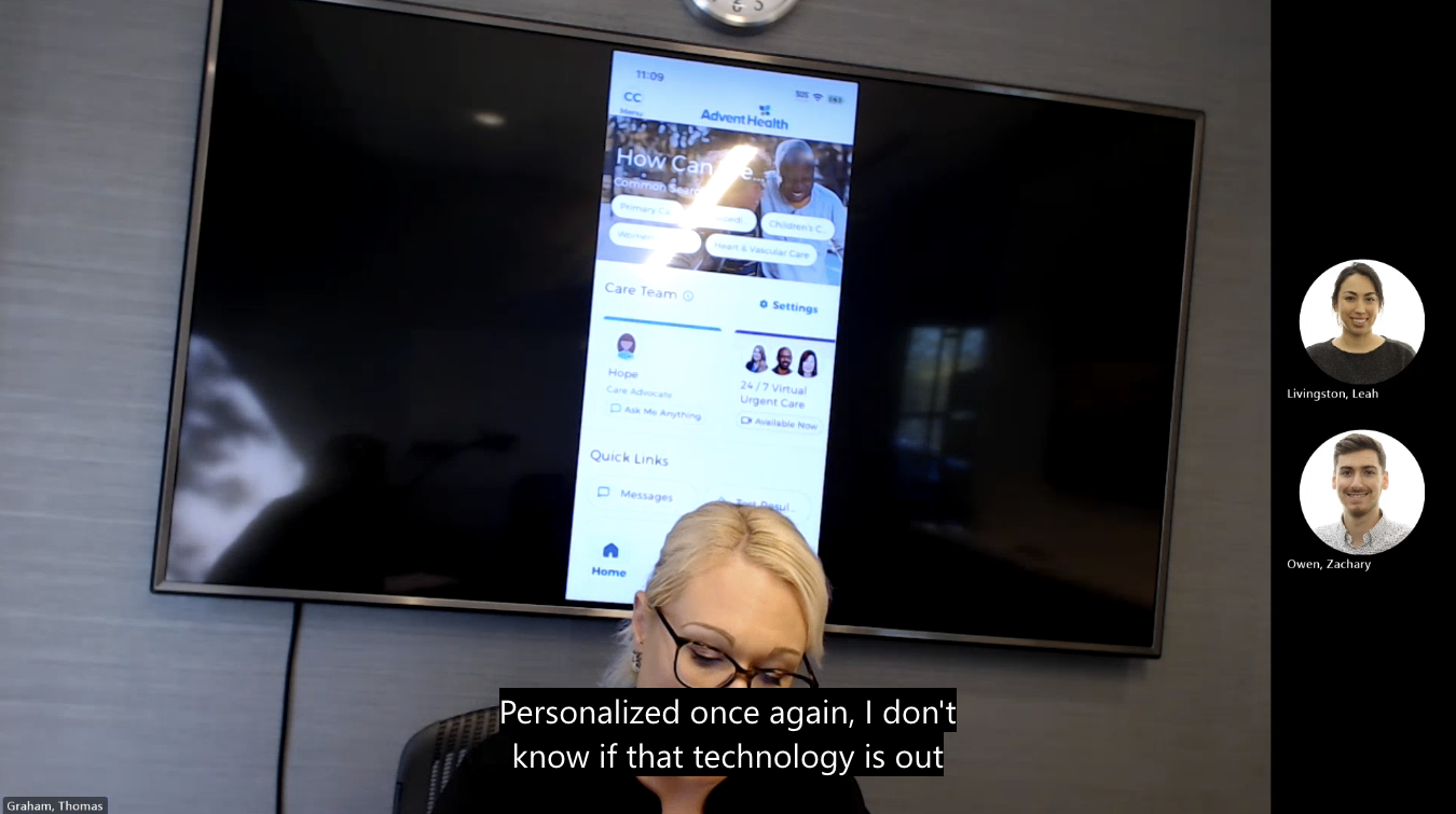
Since these were established patients, the participants wanted to see their specific health care providers listed first on the home page and desired customized recommended search options tailored to their individual health needs. In one instance, a participant accidentally misinterpreted the providers listed on the 24/7 Virtual Care Card as someone else's account when logging in to his personal account to review the app. However, after he scrolled, he found his actual providers and realized that he was logged into his own account.
Another feature that was mentioned was the integration of the app with their Apple health devices. This feature not only adds convenience but also aligns with our consumers' ecosystem, ensuring a seamless and holistic approach to their health care management, and another opportunity for deeper engagement.
With the ever-changing digital landscape, personalization will continue to play a crucial role in the design of health care apps. This ensures that consumers receive the necessary care and information that is focused, precise, and easy to understand. Meeting consumers' expectations for tailored content, specific search options, integration with health devices, and customization features can significantly enhance the consumer experience. By incorporating these insights, our team can create a platform that empowers consumers to make informed decisions about their health effectively.
Accessibility
Making digital applications accessible is crucial to ensure that all consumers can access, understand, and interact with the content and features provided, regardless of their abilities.
One of the primary reasons for focusing on accessibility is to make sure that individuals with different abilities can use the app effectively.
For instance, participants like Rob, who preferred visiting our office over using the app due to its complexities, highlight the importance of making the interface intuitive when our consumers enable their accessibility settings.
Similarly, Henry, who adjusted his settings, found the interface severely disjointed with text being hidden or unreachable, which emphasizes the need to review our designs with these settings enabled.
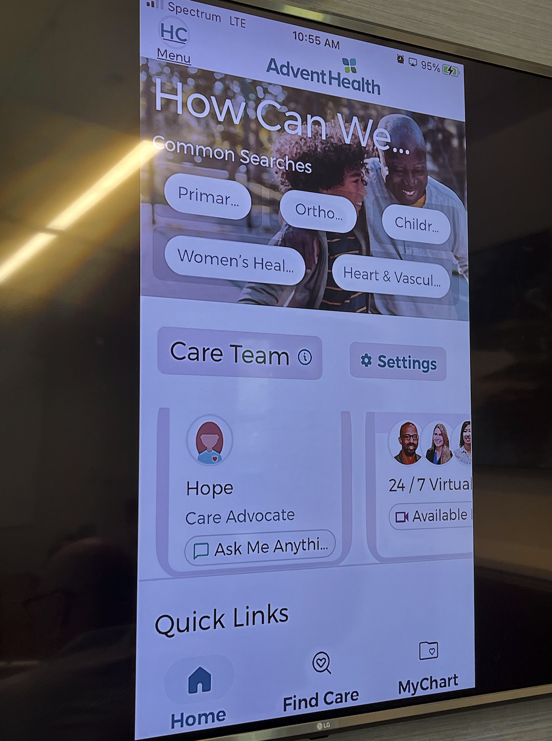
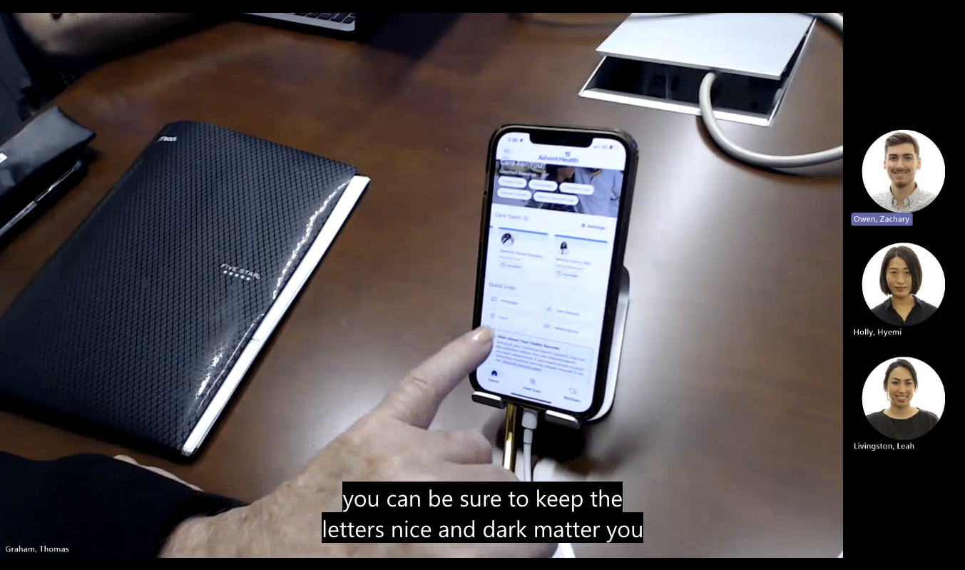
Font size that is too small or overly stylized can be challenging for consumers, especially those with visual impairments. Charles experienced significant frustration and comprehension issues due to insufficient contrast on certain screens within the app, particularly on web screens that we linked out to.
By prioritizing these design aspects, the app can cater to a broader audience, including consumers with varying visual abilities, and offer a more inclusive and satisfying experience for all our consumers.
List of Bugs Observed
Below are the bugs and glitches that impacted the functionality and performance of the app. Several participants faced issues with messaging, scheduling, search, provider profiles, family access, and 24/7 virtual care features. Some participants also reported the app crashing or freezing during sessions. Click on the links below to learn more about these issues.
- In 24/7 Virtual Care, "Get Started" just loads and then goes nowhere.
- When selecting call for events and classes, it didn't work.
- Searching and finding care isn't working.
- Clicking on the location that pops up when typing isn't working.
- Quick links are not loading.
- These common search options aren't working when clicked.
- Clicking schedule visit on the care team provider just goes back to the home page.
- The find care button isn't working.
Conclusion
The comprehensive feedback gathered from user testing sessions offers valuable insights into the strengths and areas for improvement within the AdventHealth Mobile App redesign. Participants expressed appreciation for the app's new layout and cleaner design. Positive feedback was particularly noted regarding the ability to message providers, schedule appointments, and access various health-related information seamlessly.
However, challenges were identified, mainly in terms of usability and navigation. Participants encountered difficulties in finding specific features, understanding the app's layout, and differentiating between MyChart and AdventHealth home screens. Functionalities such as provider profiles, care team cards, and quick links were reported as malfunctioning, leading to frustration.
Additionally, participants highlighted concerns about accessibility and design, emphasizing issues related to color contrast, font size, and the clarity of certain terminologies. Integration challenges, especially with Apple Health, and inconsistencies in data presentation, particularly with past medical records, were also noted.
In conclusion, the feedback underscores the significance of addressing these issues to enhance consumer experience. By resolving navigational challenges, improving accessibility, and ensuring consistent integration of data, AdventHealth can create a more intuitive and consumer-friendly mobile app, aligning with participants' expectations and needs effectively. Incorporating these insights into the app's development will contribute significantly to its overall success and consumer satisfaction.
Recommended Next Steps
- Explore why the find care feature on iOS devices was not functional.
- Keep the consumers within the app as much as possible and avoid taking them out of the app to display dot com pages. If it is necessary to take them out, provide clear instructions and navigation on how to get back to the app.
- Highlight and explain some of the features or information that the consumer may not notice or understand on the app. Provide clear and useful descriptions, instructions, and examples on how to use these features or information.
- Consider removing the account-specific information in the Health Updates section, such as log-in options and location settings, out of the health updates section and keep only the information pertaining to the patient's healthcare such as appointment reminders.
- Consider moving Hope and 24/7 Virtual Care at the end of the Care Team list for established patients who are more active with their providers.
- Explore how we can customize the health care experience for our existing patients by providing them with personalized health information and care options that cater to their specific needs while also adapting our options and care recommendations for patients who are new to health care or do not have a care team yet, to help them get started with their health journey.
- Explore how we can provide direct access to historical records without requiring consumers to click through multiple links or send requests.
- Consider the major accessibility standards and test layouts in more extreme conditions.
- Continue to test the app with consumers to identify and resolve any new issues that may arise from our 3.0 release.
Contact
Want to talk through the App 3.0 study?
The findings, research choices, or the decisions this work informed — happy to get into any of it.
A good conversation is usually the best start.