the project overview
Defining our Goals
Tare a number of information sites out there that discuss the dangers of addiction, but their main goal is to coral the user towards calling a hotline rather than providing the vital information to deal with the addiction
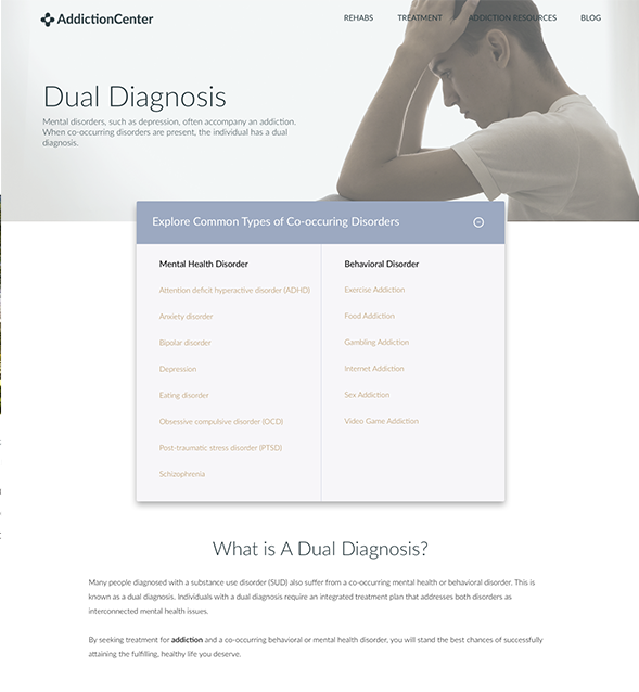
We focused on providing people with the information, support, and resources they need to find hope and healing in the long road to recovery. This included the loved ones of those addicted.
- Create interactive map
- Fill out Call Request forms
- Increase Trust
- Implement A/B Testing software
the discovery process
Our Timeline
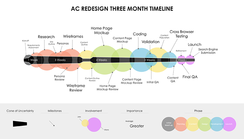
Fresh off of a new launch of DrugCenter, we immediately turned our heads to a much needed redesign of our cash cow.
We had a talented team that consisted of Content Writers, Designers, Developers, Link Builders, and Marketing Associates—for the next four weeks, we dove into the discovery phase and immediately and we started to identify where we could make an immediate impact.
Planning & Research
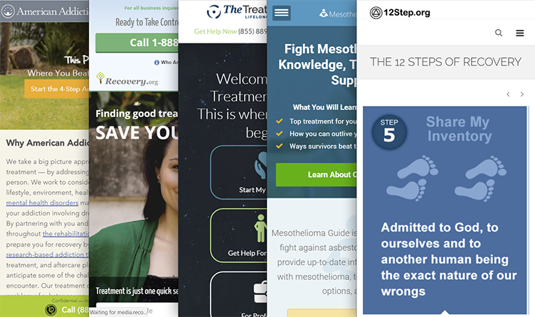
Although our intent was to develop better functionality than our competitors, we stressed that engaging in a feature-war was neither strategic, nor had the best interests of our users at heart. We were going to stick to only one new feature and do it extremely well.
To differentiate ourselves in an already mature and competitive market, we needed to position ourselves in a way that none of the other competitors seemed to be mindful of—a mobile first approach.
Seems simple enough, right?
Almost 80% of the competitors traffic originated from mobile devices. We were thrilled by the opportunity to create something more meaningful and useful.
Analyzing our existing content
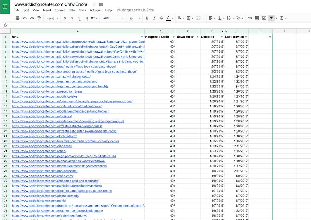
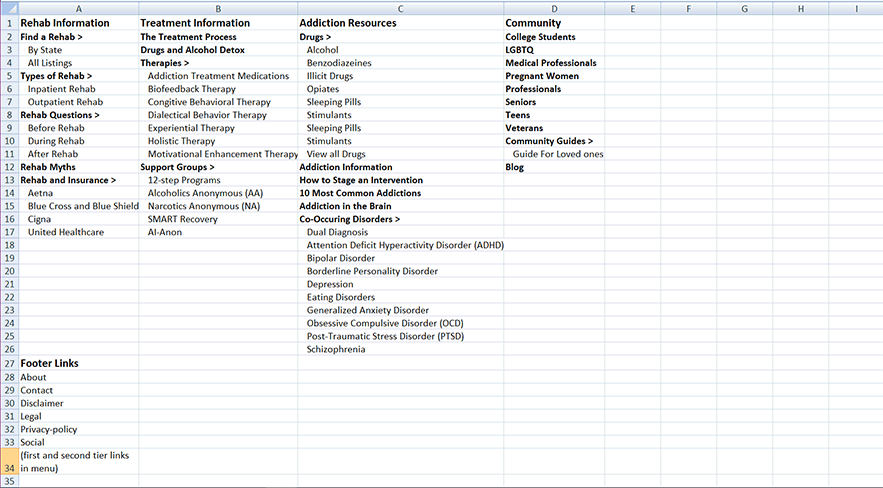
Since 2015, Addiction Center was free from the Google sandbox and flourishing. This was a direct result of the robust content being produced by the content team. This site had more content than any other site I've worked on in the past and the crucial first-step in the path to understanding any content-heavy website is a content audit.
When results from the audit took shape, we noticed a few issues that were easily solvable and would have the biggest impact. One of those issues were the amount of dead links that were being reported—almost 150 pages in total.
Getting to know our audience
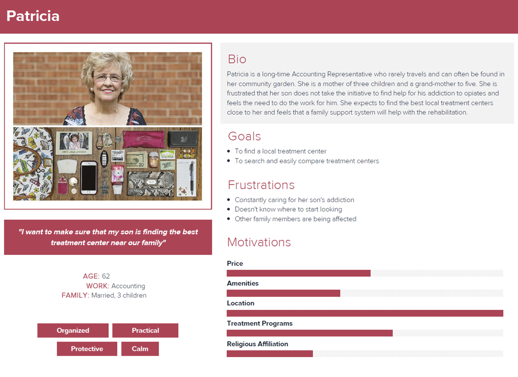
With the content team plugging away on revising and creating the updated content, we turned to analyzing our users. Most of the decisions on the original Addiction Center project were made using personal assumptions as well as experiences from the past, which can be at risk for growing stale. While we strived to create content that was helpful for anyone who needs treatment, we needed to pinpointt the users most likely to reach out for help, either for themselves or a loved one.
We involved actual people from our audience at the beginning and kept them involved throughout the project's timeline. With qualitative and quantitative data obtained through site visits, user surveys, as well as implementing A/B testing software from Optimizely to keep a pulse on our design decisions, we were able to tailor our message
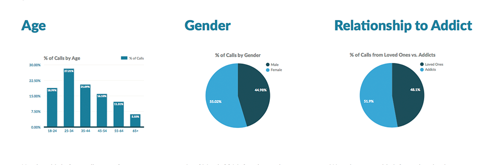
Nearly a third of the calls come from a younger demographic, those between the ages of 25-34. We also saw that those over the age of 65 are the least likely to call in. This helps in choosing language, blog topics, and even imagery that our target audience will relate to.
We partnered with a national behavioral health group which gave us access to hundreds of individuals who completed rehabilitation. We conducted several contextual inquiries through a set of surveys—HIPPA regulations prevented us from contacting the individuals directly. The main focus of our questionnaire was to understand the different steps the users took when searching for a rehabilitation center, what was their mental model during that process, and what interactions they had in common and what they did not
There were numerous questions submitted by the team and I, but to keep process brief, we finalized a list that touch on each category.
- [Process]
- How did you choose this Facility?
- [Opportunity]
- What obstacles did you encounter when searching for rehab?
- [Mental Modal]
- How was your experience different from what you expected before going in?
- [Variable]
- Was Location a factor in your choice? (why or why not?)
- [Interaction]
- How did your relationships affect your decision to enter rehab?
- [Motivation]
- What did you enjoy most/least about your stay in Rehab?
- [Mental Model]
- When did you realize, you needed treatment?
Developing the artifacts
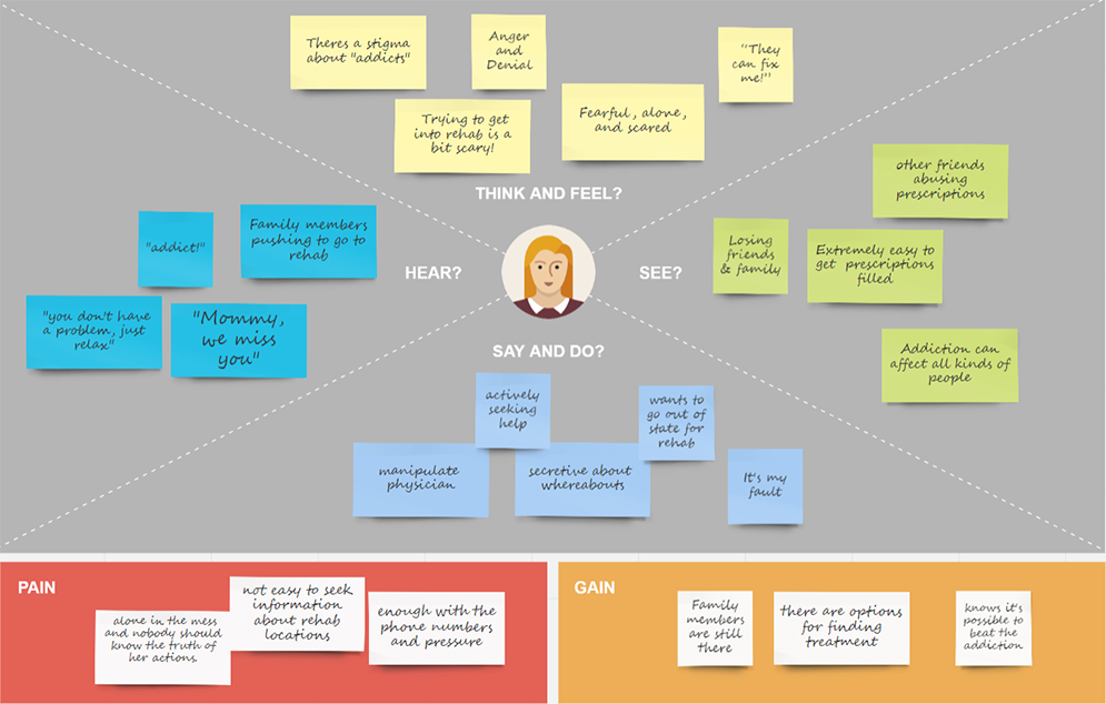
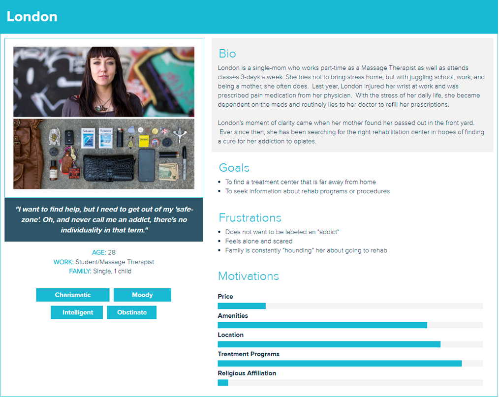
Now that we had a fairly accurate grasp of the audience, their mental model when searching for rehab, and their pain points, we started to develop the artifacts needed to verify the bulk of our future design decisions.
the design phase
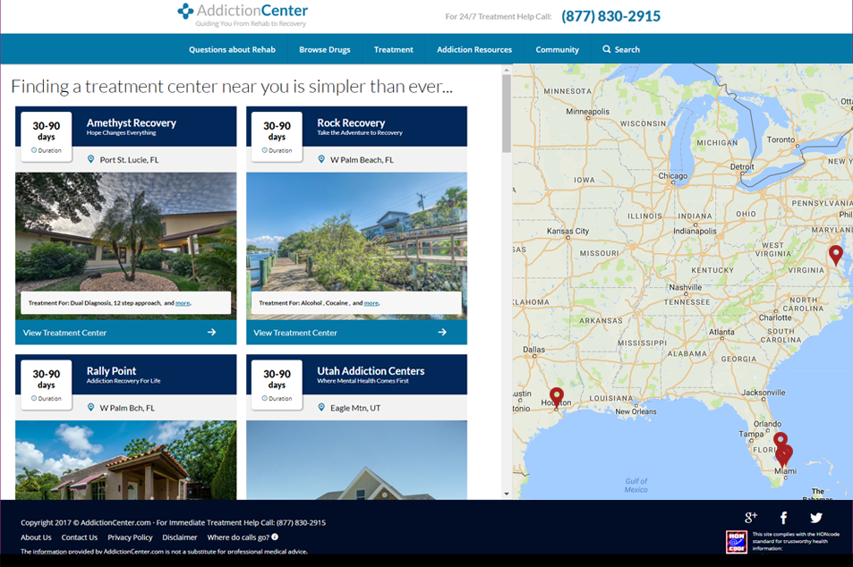
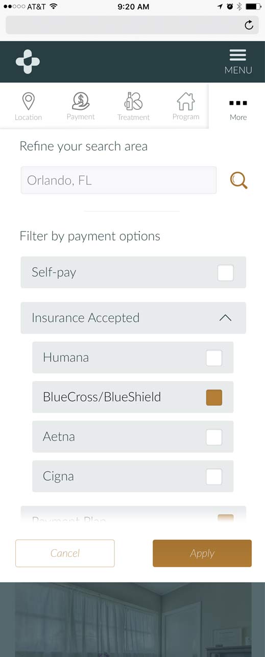
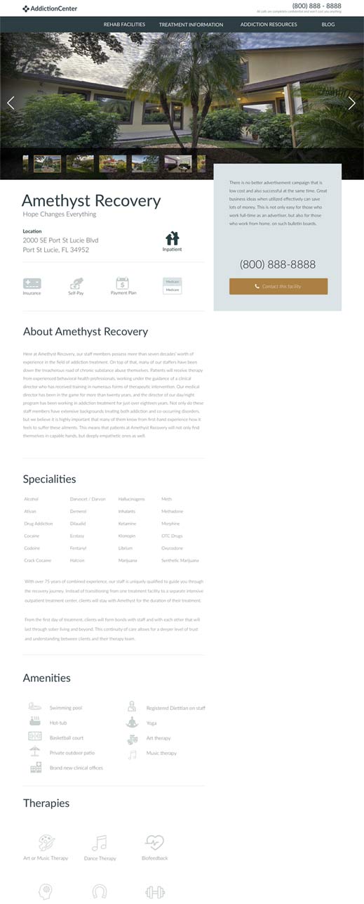
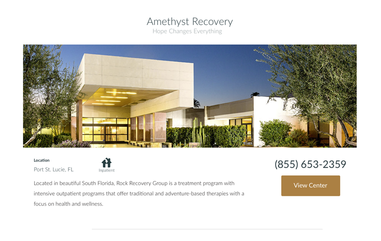
We were pretty successful at driving call traffic, but we wanted to offer something more to the users who felt turned-off by the pressure of speaking to a live person. When we discovered that people wanted as much flexibility in searching for treatment centers as they did searching for hotels, we decided to build upon our treatment locator map to give them the flexibility to search on their own terms. Not to mention the revenue opportunity that would be generated from listing within the search results.
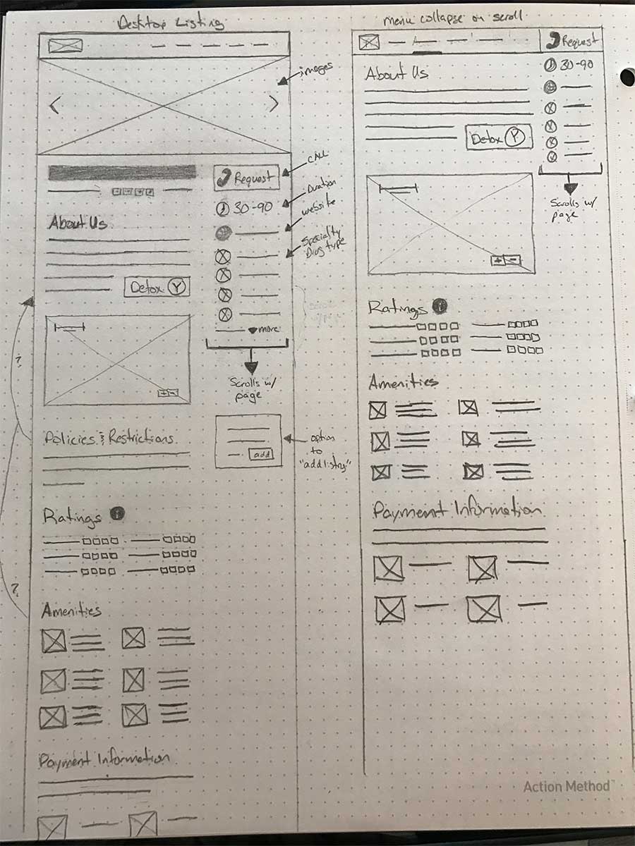
UI Sketches for the new search functionality
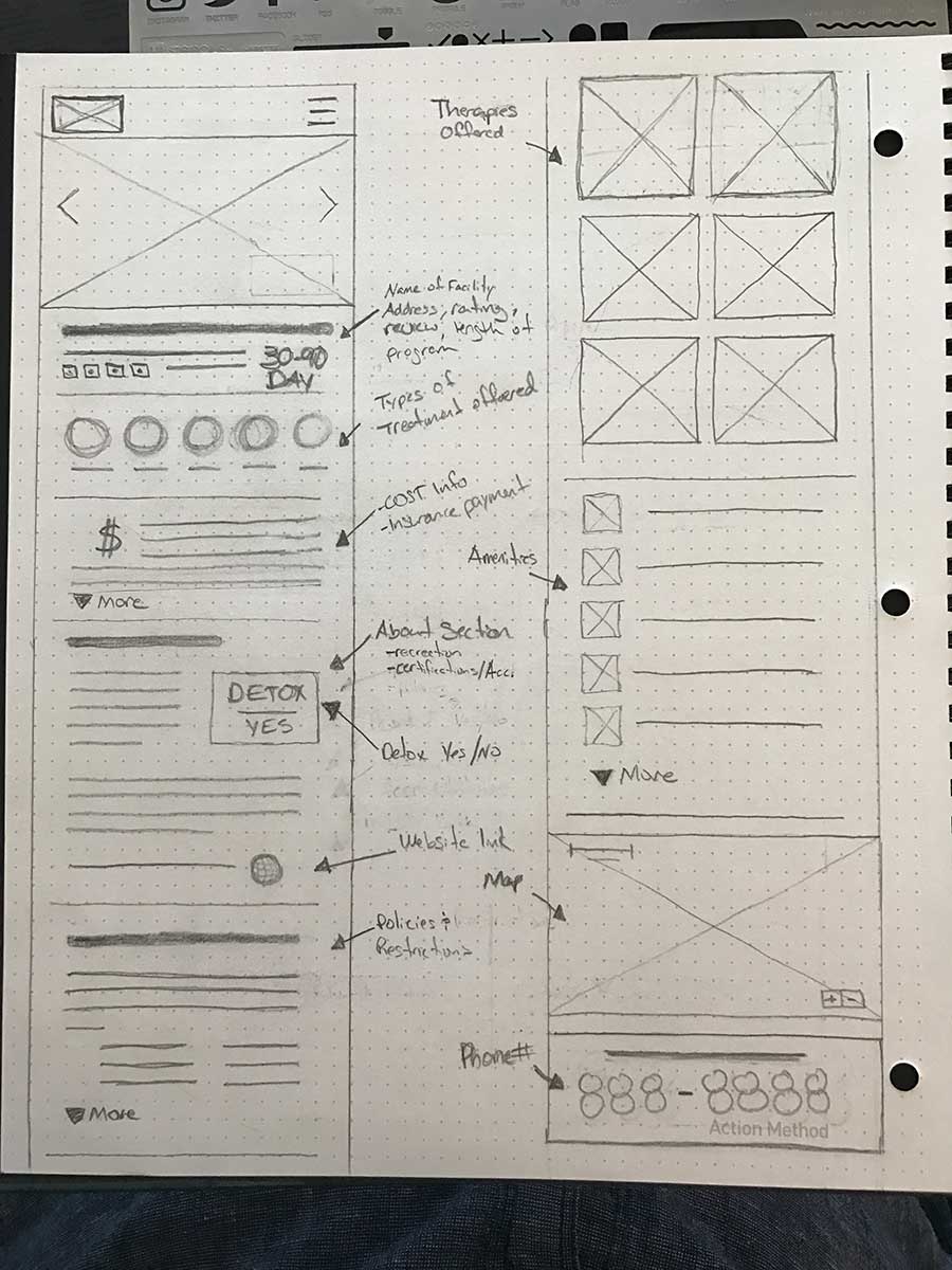
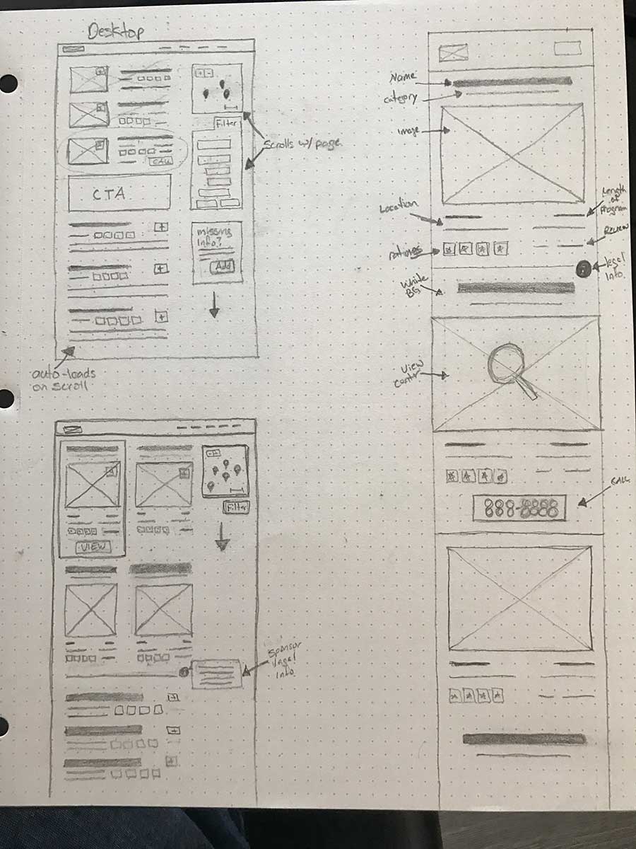
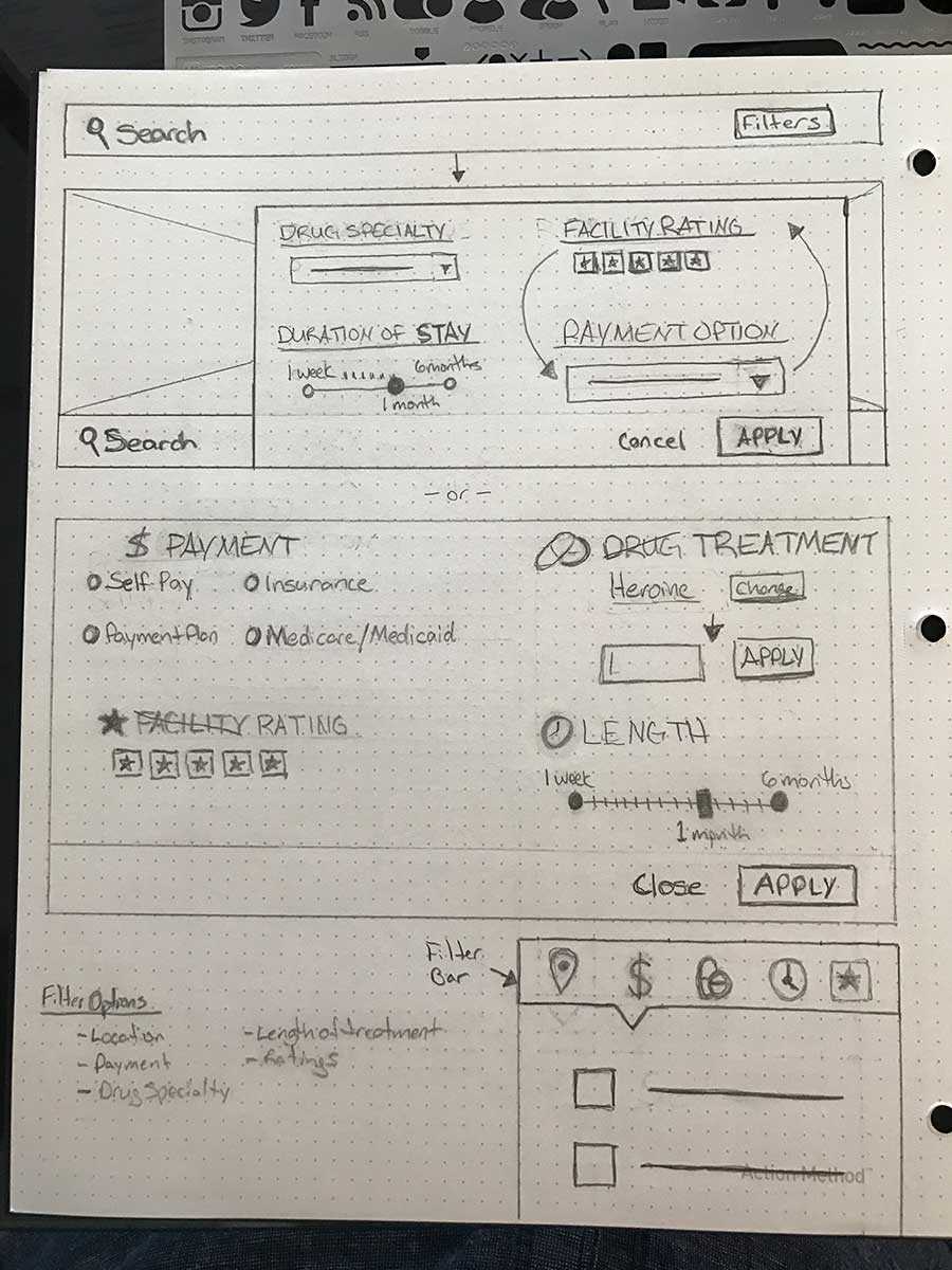
Inital interface sketches
Building the Scaffolding
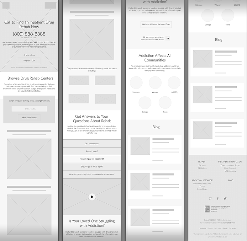
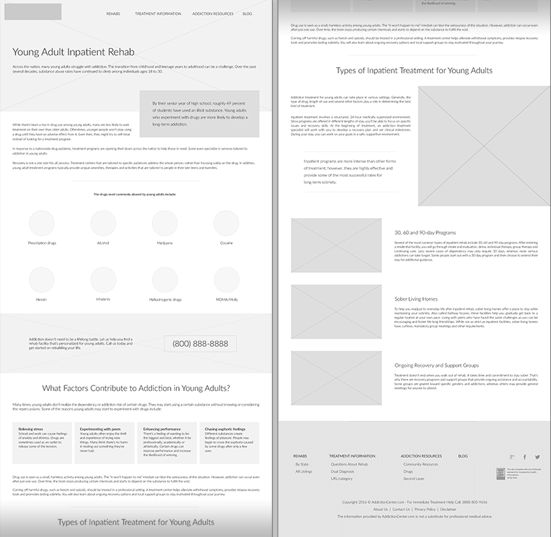
While we were finalizing the requirements for the new search features and treatment center map, we sketched out the rest of the site and started developing the wireframes for the home page and detail pages.
Selecting a Color Scheme
The colors selected for the original site took their cue from medical websites and was quickly becoming dated. The current color scheme didn't express a feeling of "comfort" nor trustworthiness—it just felt cold and a bit childish.
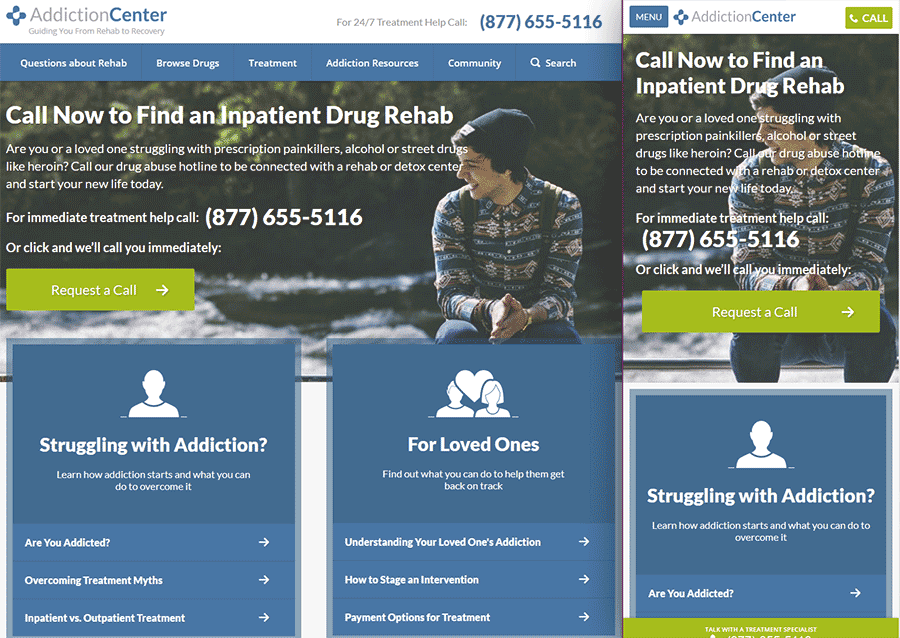
One of our goals with the redesign was to instil trust and from what we gathered from our research, stress and overloading external emotions were negative triggers for those needing help. How can we come accross as trustworthy if we are doing the exact same thing as everyone else in the industry?
What we needed was a color scheme that was calming yet still had enough contrast to visually guide our users to important information they would need as well as any CTA that could produce revenue or lead generations.
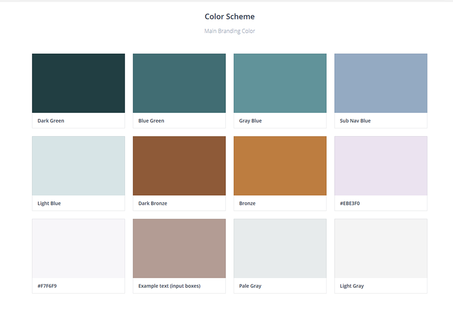
The new color scheme was a huge success among the team as well as our test users. We chose a color palette that was inviting and calming, yet still impactful. The complimentary color of the CTAs and high-contrast areas of importance ensured the users were not bogged down by cognitive overload.
implementation
Launching the New Addiction Center
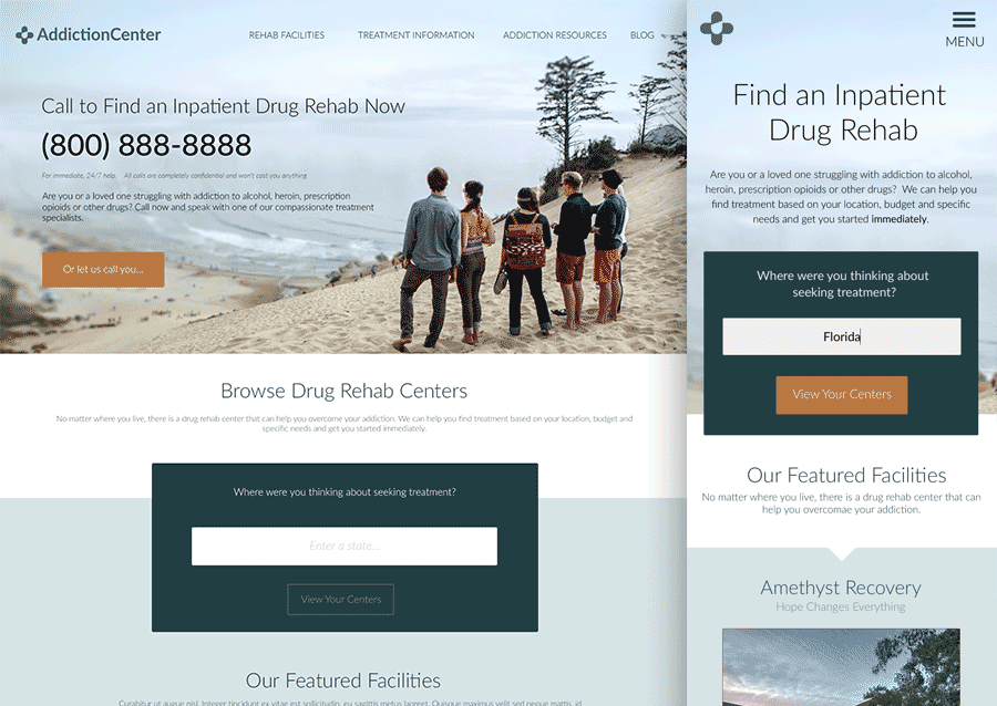
After the several months of hard work and preparation, we launched the new Addictioncenter.com with much success! We saw an increase in all three KPIs set prior to the project. Addiction Center saw a 30% increase in conversions as well as an increase in call volume, site traffic has increased 18%, and treatment center ad sales have been rising.
